BAR DIVE PODCAST
FREELANCE WORK
Branding / Art Direction & Design
Hosted by Kayla Anchell, Bar Dive is a podcast about the people who are always there for folks on their nights out. Making drinks, taking food orders, bussing tables, and sometimes playing a vital role in building community spaces where people can connect.
General Logo Criteria - The mark should was developed with the following considerations in mind:
Content—compatible with the nature and purpose of the brand
Suitability for digital media—lends itself to all applications and scaleability
Distinctiveness—stands out from competitors
Contemporaneity—the mark is relevant regardless of time period
Memorability—the mark creates a strong, lasting impression
Reliability—the mark suggests a sense of credibility
The logo represents a podcast that is:
Authentic
Approachable
Relaxed
High-quality
My contributions
Research, concept development, art direction, presentation to client, graphic design, and production design of deliverables.
Logotype
Primary logo
Brand Typefaces

The Diamonds type family was designed by Hannes von Döhren in 2012. It is an experimental search for geometric new letterforms, which are still easy to read and generate some unexpected attention. Hannes wanted to create a straight and clear typeface but pull away from the path of classic and well learned letter shapes.
Color Palette
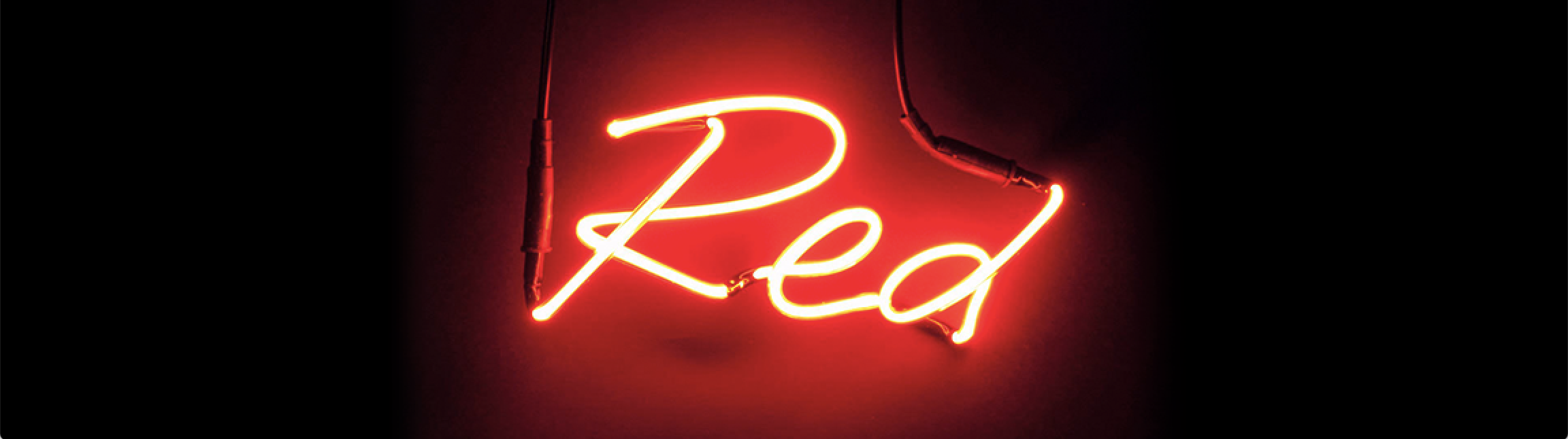
The color red is associated with energy, strength, power, passion, desire and love. You’ve probably noticed that the bar industry is stocked with this color—that’s because it’s highly effective at grabbing attention and the brighter the red, the more it stimulates conversation and raises your heart rate.
Color values

The primary logo is established in black brick background, but can also be placed on a solid black background if needed.
Black brick background version
Black background version
Branding applications


Promotional coasters
Listen to Bar Dive on:
Client: Kayla Anchell
Agency: Monserrat Garcia
My Role: Art Direction and design